The iOS 6 Review: Maps Thoroughly Investigated and More
by Brian Klug & Saumitra Bhagwat on September 19, 2012 2:21 PM ESTMobile Safari
There are really only a few things that a smartphone OS needs to do right. Messaging (SMS and email), 3rd party applications (with a marketplace), PIM (personal information management – calendar, contacts, etc), and finally inclusion of a decent web browser. This last section is devoted to the iOS 6 improvements to Safari.
With iOS 6, Apple hasn’t dramatically changed anything but (you guessed it), made some tweaks. First is the inclusion of a full screen mode for landscape.

(Left) New fullscreen button at bottom right, (Right), Full screen view for Safari in iOS 6
If you rotate into landscape, there’s a new full screen icon which appears. Tap it and boom you’re given a full screen browsing experience without the loss of status bar and bottom bar. Tapping again in full screen mode brings up the toggle to switch back into windowed mode.
The other new feature is inclusion of an offline reading mode. Tapping on the send/action button lets you send the current page to an offline cache. I have no doubt this leverages some of the reading view backend. There’s a progress indicator under the bookmarks icon while the device is caching pages for reading offline, and it continues on into the background. Going in that menu brings you to another category with a list of what all you’ve made offline that has and hasn’t been read yet.
Another feature is iCloud tabs, which as the name suggests syncs open tabs across devices with iCloud logins. At some level this brings MobileSafari back up to parity with the equivalent feature in Chrome (synced tabs).
JavaScript Performance
This section wouldn’t be complete without mention of the speedups made to Nitro for MobileSafari, which is Apple’s JavaScript JIT engine which works for ARMv7. I tested the iPhone 4 and 4S on iOS 5.1.1 and iOS 6 GM and saw around a 10% and 30% improvement, respectively. I’m not entirely sure why there’s such a discrepancy between the two, however it’s possible that the new Nitro sends things off to multiple threads more effectively.
| iOS 5.1.1 versus iOS 6 GM | ||||||||
| Device | iOS Version | Sunspider 0.9.1 | Browsermark | HTML5test.com | css3test.com | |||
| iPhone 4 | iOS 5.1.1 | 3553.1 | 52557.0 | 324+9b | 459 of 946, 221 | |||
| iOS 6 GM | 3358.8 | 57351.0 | 360+9b | 498 of 946, 221 | ||||
| iPhone 4S | iOS 5.1.1 | 2242.9 | 86062.0 | N/A | N/A | |||
| iOS 6 GM | 1716.0 | 109775.0 | N/A | N/A | ||||
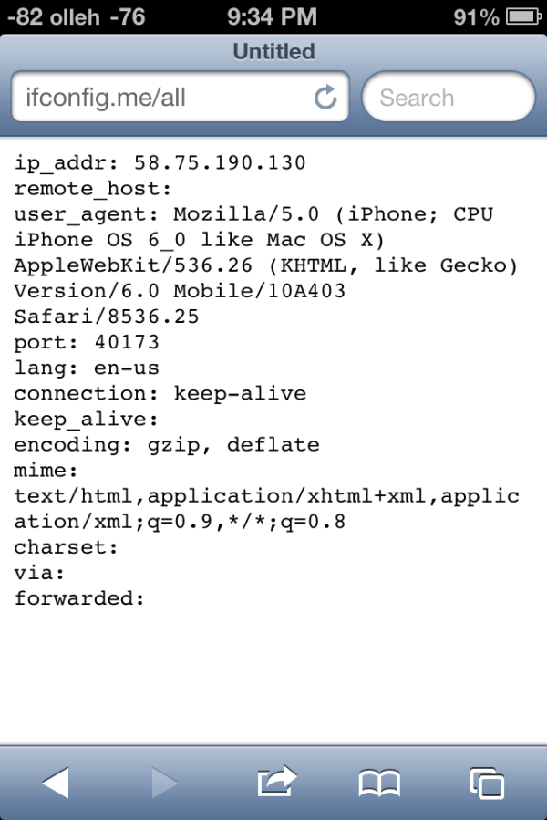
There’s also a nice jump in HTML5 feature support, which I’m always a fan of seeing. The user agent string in iOS 6 GM now reports webkit 536.26 alongside safari version 8536.25.


105 Comments
View All Comments
tipoo - Wednesday, September 19, 2012 - link
Pretty sure the 4S is faster than the 4 :)Ryan Smith - Wednesday, September 19, 2012 - link
I'm assuming you must be referring to the SunSpider results? In that case lower is better, so everything looks correct here.tipoo - Wednesday, September 19, 2012 - link
I think they were changed, when I looked last the 4 had lower Sunspider and higher Browsermark scores, and it also had N/A beside the other two, now the 4S has the N/A and better scores.Henk Poley - Wednesday, September 19, 2012 - link
Related, I consistently get a Sunspider 0.9.1 score of about 3000 +/- 1% on my iPhone 4 GSM. Typo? 33.. instead of 30.. ?dsumanik - Thursday, September 20, 2012 - link
blah blahThe new maps suck...they are a significant step down, in dataset AND functionality.
Users in the US might ALMOST get the same experience but everywhere else on the planet got screwed.
There are spelling errors, missing roads, improperly labeled cities and for the most part, significantly less detailed maps.
I live in a very remote community, in northern canada...there is a GOOGLE STREET VIEW picture of my house and street.
There is no way Apple will ever come up here to offer the same level of detail...im simply in too small of a market.
There isnt even color photos of my town.
LOL!
Jobs would never have let this slide until it was competitive... right now it simply is inferior in every single way.
mrgulabull - Wednesday, September 19, 2012 - link
The "trouble building" you mention actually looks like that. It's the Walt Disney Concert Hall. If anything I'd say the 3d model is remarkably good.Here's an aerial shot from Google Maps
https://maps.google.com/maps?q=walt+disney+concert...
ratte - Wednesday, September 19, 2012 - link
It's the building above that (the Dorothy Chandler pavillion) that looks badBrian Klug - Wednesday, September 19, 2012 - link
OH wow, ok, well that's interesting... Fixing now.-Brian
nathanddrews - Thursday, September 20, 2012 - link
If you had seen the "Get Smart" movie, you would know. :Prd_nest - Wednesday, September 19, 2012 - link
Seriously, whatever I have seen so far, Apple maps are absolute failure in India. It's actually pathetic in terms of actual data. Forget about features, they simply don't have data. It's so bad that I can't even think why they should launch iOS 6 here? Comparison with google maps?? just forget it.. and all those fancy 3D flyover, well probably by 2025 if we are lucky..