The iOS 6 Review: Maps Thoroughly Investigated and More
by Brian Klug & Saumitra Bhagwat on September 19, 2012 2:21 PM ESTPhone
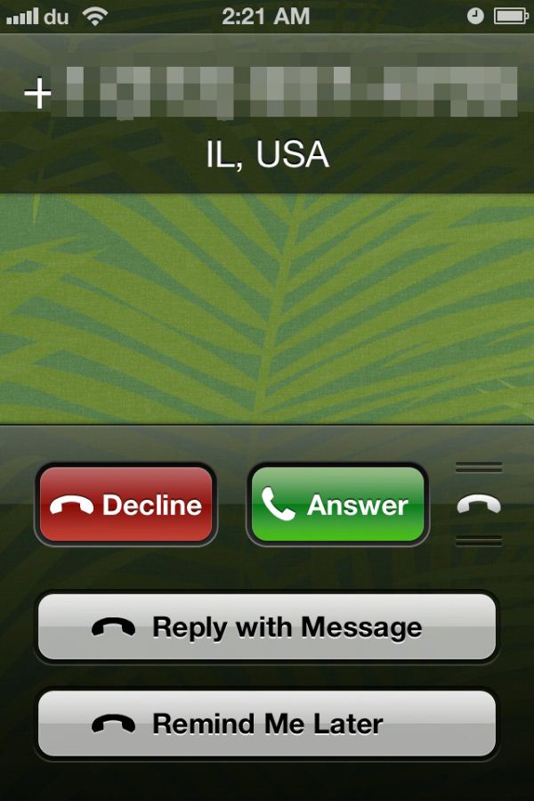
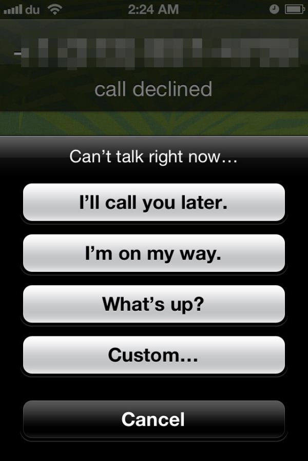
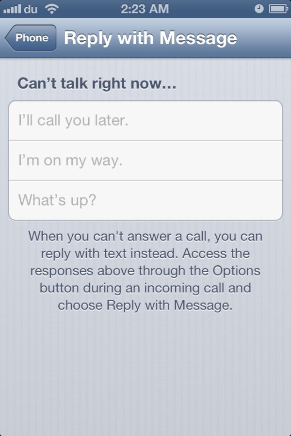
With iOS 6, Apple has finally added some much needed call management features to the Phone app and a simple UI to get the job done. So now when you get a call (and can’t answer), there’s a new swipe-up menu that lets you reply to the caller with a message, or set a reminder to call back. The UI is similar to the lock screen camera option introduced in iOS 5.1.
Apple includes a few pre-defined messages like “I’ll call you later.” and “I’m on my way.”, but you can reply with a custom message as well, if time permits. The text for the pre-defined messages can be edited to your liking under Phone settings.
The reminder feature allows you to set a time or location based reminder, which is quite handy. I’m notoriously bad at calling people back, and I have to admit I’ve used these reminders quite a bit already.
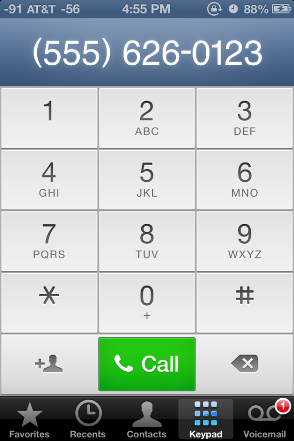
Finally, the dialer UI has been toned down to softer hues of white and blue; a stark departure from the darker, bubbly UI that everyone’s been accustomed to. I believe the main dialer view was changed to this grid format to accommodate the iPhone 5, where it resizes up and takes up the whole vertical area in portrait mode. That said, it makes no sense to change this so radically and then leave the in-call dialer the old style, which retains the original iPhone UI look.
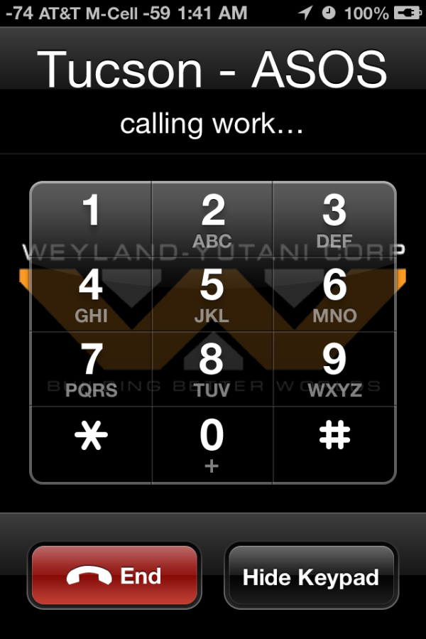
Why are these two dialers from iOS 6 now vastly different styles? (Left: in-call, Right: mail dialer)
That’s about it for the Phone app in iOS 6. The new call management options have been a long time coming, but have been integrated rather well in the OS.
Do Not Disturb
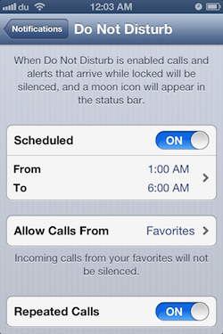
Continuing the focus on call management, Do Not Disturb is another well thought out feature in iOS 6 that is incredibly useful if you’re planning on skirting calls. This is accomplished in a couple of different ways. You can designate scheduled “Quiet Hours”, during which all calls, texts and notifications will reach your phone, but stay hidden until the quiet hours end. During quiet hours, your phone will not ring, vibrate or light up unless you receive a call from an allowed group of people, such as your Favorites. All missed events during quiet hours are stacked, and you can review them once quiet hours end.
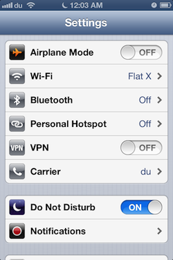
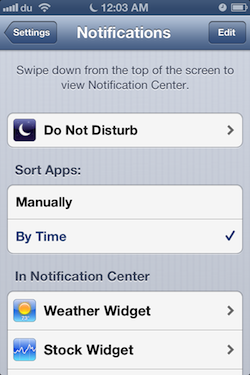
There’s also an option to enable repeated calls, which does not suppress a second call received within three minutes of the first one. Do Not Disturb can be toggled from the main Settings page, but you’ll need to go into Notifications to set the quiet hours and play with the other options.
The DND features are a welcome addition to iOS. It's good to see improvements to the phone part of this smartphone platform.




105 Comments
View All Comments
tipoo - Wednesday, September 19, 2012 - link
Pretty sure the 4S is faster than the 4 :)Ryan Smith - Wednesday, September 19, 2012 - link
I'm assuming you must be referring to the SunSpider results? In that case lower is better, so everything looks correct here.tipoo - Wednesday, September 19, 2012 - link
I think they were changed, when I looked last the 4 had lower Sunspider and higher Browsermark scores, and it also had N/A beside the other two, now the 4S has the N/A and better scores.Henk Poley - Wednesday, September 19, 2012 - link
Related, I consistently get a Sunspider 0.9.1 score of about 3000 +/- 1% on my iPhone 4 GSM. Typo? 33.. instead of 30.. ?dsumanik - Thursday, September 20, 2012 - link
blah blahThe new maps suck...they are a significant step down, in dataset AND functionality.
Users in the US might ALMOST get the same experience but everywhere else on the planet got screwed.
There are spelling errors, missing roads, improperly labeled cities and for the most part, significantly less detailed maps.
I live in a very remote community, in northern canada...there is a GOOGLE STREET VIEW picture of my house and street.
There is no way Apple will ever come up here to offer the same level of detail...im simply in too small of a market.
There isnt even color photos of my town.
LOL!
Jobs would never have let this slide until it was competitive... right now it simply is inferior in every single way.
mrgulabull - Wednesday, September 19, 2012 - link
The "trouble building" you mention actually looks like that. It's the Walt Disney Concert Hall. If anything I'd say the 3d model is remarkably good.Here's an aerial shot from Google Maps
https://maps.google.com/maps?q=walt+disney+concert...
ratte - Wednesday, September 19, 2012 - link
It's the building above that (the Dorothy Chandler pavillion) that looks badBrian Klug - Wednesday, September 19, 2012 - link
OH wow, ok, well that's interesting... Fixing now.-Brian
nathanddrews - Thursday, September 20, 2012 - link
If you had seen the "Get Smart" movie, you would know. :Prd_nest - Wednesday, September 19, 2012 - link
Seriously, whatever I have seen so far, Apple maps are absolute failure in India. It's actually pathetic in terms of actual data. Forget about features, they simply don't have data. It's so bad that I can't even think why they should launch iOS 6 here? Comparison with google maps?? just forget it.. and all those fancy 3D flyover, well probably by 2025 if we are lucky..