The iOS 6 Review: Maps Thoroughly Investigated and More
by Brian Klug & Saumitra Bhagwat on September 19, 2012 2:21 PM ESTUnlike other apps in iOS, Mail has seen a steady stream of new features, usability improvements and UI tweaks in almost every release. We’re on the 6th major release of iOS, and Mail is already a very mature app in terms of its feature set and capabilities. At this point, there is very little that can be done to improve the core functionality of the app. So the focus is on small usability tweaks that enhance the overall user experience and workflow.
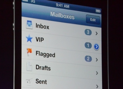
In iOS 6, Mail gets support for VIP lists introduced in OS X Mountain Lion. The main screen gets a dedicated VIP folder that lets you keep track of emails from the important people in your life. Tap the blue arrow, and you can easily manage your VIP lists and set custom notification alerts. The latter can also be accessed through Notifications under Settings. I find VIP lists to be quite useful, especially on my old Gmail account that gets more spam mail than mail that I actually care about. VIP lists makes it really easy to filter out and keep track of important emails.

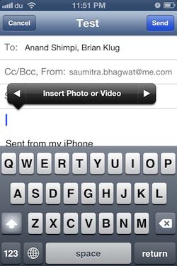
One of my biggest gripes about Mail has finally been addressed in iOS 6, and that is the ability to add photos and videos to emails from within the app. This was quite frustrating earlier, when I’d write entire emails, only to realize that I needed to scrap the draft and rewrite the whole thing again after adding the photo/video from a third app. Well not anymore; a simple long tap brings up a contextual menu that lets you add a photo or video to your email. I’m amazed at how such basic functionality has been missing from the Mail app until the 6th release of the OS.
To top it off, there’s a cool new animation on the main screen when you swipe down, that refreshes all mailboxes simultaneously. Quite the time saver.


105 Comments
View All Comments
tipoo - Wednesday, September 19, 2012 - link
Pretty sure the 4S is faster than the 4 :)Ryan Smith - Wednesday, September 19, 2012 - link
I'm assuming you must be referring to the SunSpider results? In that case lower is better, so everything looks correct here.tipoo - Wednesday, September 19, 2012 - link
I think they were changed, when I looked last the 4 had lower Sunspider and higher Browsermark scores, and it also had N/A beside the other two, now the 4S has the N/A and better scores.Henk Poley - Wednesday, September 19, 2012 - link
Related, I consistently get a Sunspider 0.9.1 score of about 3000 +/- 1% on my iPhone 4 GSM. Typo? 33.. instead of 30.. ?dsumanik - Thursday, September 20, 2012 - link
blah blahThe new maps suck...they are a significant step down, in dataset AND functionality.
Users in the US might ALMOST get the same experience but everywhere else on the planet got screwed.
There are spelling errors, missing roads, improperly labeled cities and for the most part, significantly less detailed maps.
I live in a very remote community, in northern canada...there is a GOOGLE STREET VIEW picture of my house and street.
There is no way Apple will ever come up here to offer the same level of detail...im simply in too small of a market.
There isnt even color photos of my town.
LOL!
Jobs would never have let this slide until it was competitive... right now it simply is inferior in every single way.
mrgulabull - Wednesday, September 19, 2012 - link
The "trouble building" you mention actually looks like that. It's the Walt Disney Concert Hall. If anything I'd say the 3d model is remarkably good.Here's an aerial shot from Google Maps
https://maps.google.com/maps?q=walt+disney+concert...
ratte - Wednesday, September 19, 2012 - link
It's the building above that (the Dorothy Chandler pavillion) that looks badBrian Klug - Wednesday, September 19, 2012 - link
OH wow, ok, well that's interesting... Fixing now.-Brian
nathanddrews - Thursday, September 20, 2012 - link
If you had seen the "Get Smart" movie, you would know. :Prd_nest - Wednesday, September 19, 2012 - link
Seriously, whatever I have seen so far, Apple maps are absolute failure in India. It's actually pathetic in terms of actual data. Forget about features, they simply don't have data. It's so bad that I can't even think why they should launch iOS 6 here? Comparison with google maps?? just forget it.. and all those fancy 3D flyover, well probably by 2025 if we are lucky..