Dell XPS 15 Haswell Edition: QHD+ with a Refined Design
by Jarred Walton on March 6, 2014 7:00 AM ESTDell XPS 15: QHD+ LCD Testing
Considering that this is the first QHD+ display that I’ve tested in a laptop, I’m going to start our performance metrics there. We’re changing quite a few things with our laptop reviews for 2014 and moving forward, and one of the most important changes will be in the area of testing the displays. We’ll be using the same software and hardware that we use for testing desktop displays, and hopefully the results of our new testing will shake things up a bit in the laptop LCD world. Basically, we’re using CalMAN 5 to perform testing, and that now allows us to report uncalibrated as well as calibrated color results.
Update: After learning of the "Splendid mode" and "Generic color" options in the Windows Mobility Center settings on the XPS 15, I went back and revisited the subject of display accuracy/quality. You can read more in the full XPS 15 LCD update article. Note that most of the results below (other than the comparison charts) are from the initial testing.
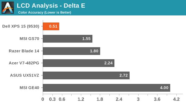
The charts and images tell the story quite well, but the short summary is this: out of the box, most Windows laptops – including the new XPS 15 with a QHD+ display – deliver colors that seem to have more in common with fantasy land than they do with accuracy. Post-calibration the display does exceptionally well, but if you lack the proper hardware and software to calibrate your display (or if you’re running an application that bypasses the LCD LUTs), you’ll be stuck with less than ideal color reproduction. How important this is will depend on the individual, but for a top quality display we really want to see manufacturers take the time to do the display justice. $5 extra per system to properly factory calibrate the display would do wonders here – we don’t need perfection out of the box, but average DeltaE of less than 2 would certainly be desirable. And with that said, let’s start with the uncalibrated results.


The RGB values are very clearly nowhere near what they should be, with most blues being 10% too high and the reds being 15% too low. Likewise, the gamma – which should ideally be a flat line – looks more like a mountain and a valley. Grayscale DeltaE is only at acceptable levels for the darkest of shades – where it matters less – while everything above the 15% level ends up with a visible error of 5.5 to nearly 8.0. Colors are a bit better in most respects, with the blues generally being the farthest off of the target, but quite a few colors actually come in below a 3.0 DeltaE.
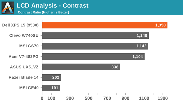
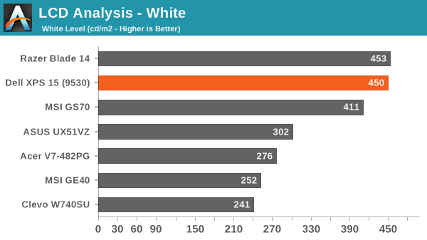
The one bright spot (literally) is that the display can get quite bright, which is good for outdoor use or when traveling. The display can reach a 450 nits (cd/m2), and the “auto-brightness” function tends to be a bit on the brighter side, which is the opposite of what I usually experience – I took the XPS 15 to CES and at one point in a presentation Anand was sitting next to me and complained the laptop was “too bright!” I had to disable the auto-brightness setting and manually drop the LCD down to 10% or so before it was acceptable. (Does anyone actually like auto-brightness adjustments on laptops? I’d personally just as soon manually tune the backlight to an acceptable level.) The contrast ratio is also very good, measuring around 1350:1. Part of that comes from the inaccurate colors, but it certainly gives the display some “pop”. Regardless, if you want accurate colors, you absolutely have to plan on calibrating the XPS 15 display. But when you do, things turn out very nice….


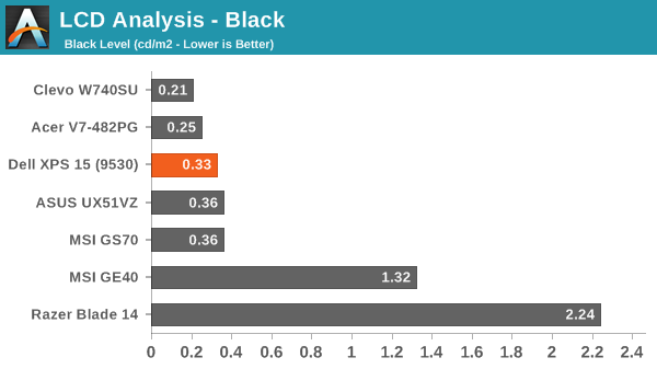
Post-calibration, color balance is close to perfect, the gamma is at least approaching a flat line (though still with bumps and valleys at the 5% and 95% marks), and DeltaE is well below 2.0 and often below 1.0, on both the grayscale and the color charts. There are still some errors in shades of blue, but those tend to be less visible to the human eye so it’s not a huge concern. Contrast ratio and maximum brightness take a hit from calibration, as the white levels are now where they should be, but the XPS 15 is still able to reach nearly 1150:1 contrast with a white level of 385 nits.
_thumb.JPG)
_thumb.JPG)
_thumb.JPG)
_thumb.JPG)
_thumb.JPG)
As far as viewing angles go, Dell is using something they call a PPS panel, which has a wide viewing angle…except it’s not quite the same as IPS. One of the big problems with TN panels is that the colors get all messed up with off-axis viewing, and in particular the vertical viewing angles can be problematic. Let me make it clear that the PPS display is not like TN, but the colors do seem to shift a bit from extreme angles. It’s not something I’d ever experience in normal use, but if I look from an oblique angle it doesn’t quite look like an IPS or VA panel. Or perhaps it’s just that I’ve never used a 15.6” QHD+ IPS panel before? Anyway, the panel is really a great display, but I do wish Dell had factory calibrated to really set it apart.
About that High-DPI Display….
Then there’s the whole DPI scaling aspect as it applies to Windows. Depending on whom you talk to, it’s either not a problem at all (which is true if you stay within the Modern UI), or it can be a huge mess. I tend to fall more into the latter camp, as there are a lot of applications I run that apparently have not been designed with DPI scaling in mind. A big one of these, amazingly, is Chrome – how arguably one of the best browsers still utterly fails to work right with DPI scaling is a mystery to me. But there are many others – FRAPS, older applications, CalMAN 5, and the launch screens for quite a few games all came up during the time I’ve used the XPS 15.
I don’t use a Mac, so I don’t know exactly how the day-to-day experience of a MacBook Pro Retina differs, but from what I’ve gathered Apple was able to jumpstart the support for high-DPI with their first party apps and likely just giving more attention to finer details of the implementation. There are apps that play fine with high-DPI on Windows, and basically all of the Modern apps work well, but I’m having a really difficult time letting go of my actual windows to run things in full screen/split screen modes. I do it all the time on a tablet, and it feels more or less natural, but I regularly have dozens of browser tabs open (in Chrome) and 10-15 other applications running, and switching between them using the existing taskbar just works better for me. Take that as you will, but basically there are still lots of applications out there where the developers haven’t addressed the question of high-DPI support – and for applications that were released more than a couple years ago that haven’t been updated, you can guess that they may never receive such support.
The great thing is that the DPI is so high that there’s a simple workaround if you are having issues with DPI scaling: run at a lower resolution and set the scaling to 100%. It’s actually what I ended up doing after a while, as 1080p 100% on a 15.6” display still feels much more useful to me than 3200x1800 with 200% (or even 150%) scaling. It’s a bit odd for me to finally have a high-DPI laptop and find that, no, I personally don’t really benefit from the higher resolutions. Then again, my eyesight at 40 years old is perhaps not the best starting point for this sort of thing, as even 15.6” 1080p can feel a bit small on text at times. Considering how much I’ve run this display at 1080p, though, I have to say that I’ve never really noticed that I wasn’t running at native resolution.


152 Comments
View All Comments
Penti - Friday, March 7, 2014 - link
Of course Apple hasn't, but a high "virtual" res rescaled to lower looks better then wise versa. Spanned would be awful in Windows for that matter, right now that is.jphughan - Friday, March 7, 2014 - link
True, and Windows 8.1 can do that too as long as you set the HiDPI panel as primary. Apple does have the advantage of allowing you to optimize for a non-primary display though, which is handy when presenting if you want the presentation display to be sharpest but want to keep your desktop icons and such on your built-in panel.peterfares - Saturday, March 8, 2014 - link
Actually with 8.1 they added the ability for the program to actually switch which DPI it's rendering at on the fly. It's called Per-Monitor DPI-Awareness. There was even a demo video of moving an application between two monitors. The one where the majority of the application on is what scaling setting it uses to render and then scales for the other one. As soon as it is mostly on the other screen it switches to the other screen's DPI. I'm having trouble finding the video, but here is the MSDN documentation for it.http://msdn.microsoft.com/en-us/library/windows/de...
Unfortunately it seems like Microsoft themselves hardly made use of it. Not even File Explorer supports it! I think IE does, but I can't remember.
peterfares - Saturday, March 8, 2014 - link
Here is a demo application to try it out! Scroll to the bottom. Works perfectly on my computer.http://emoacht.wordpress.com/2013/10/30/per-monito...
Penti - Saturday, March 8, 2014 - link
As said, ie doesn't really use it but it does use it to detect the setting per screen and then scale by zooming. Expect apps to work differently and mostly handle this themselves.AbbyYen - Thursday, March 6, 2014 - link
retarded shrinken arrow keys...Pls Stop copying the fruit's product!
you're a pc, your strength is in Gaming and productivity?.... BABY DON'T PLAY GAMES! MATURE with big fingers do!
MySchizoBuddy - Friday, March 7, 2014 - link
what an ignorant view of Apple products.Rdmkr - Thursday, March 6, 2014 - link
Not to be a nitpicker but please distinguish properly between qHD and QHD:qHD: quarter HD, 1/4 the pixels of 1080p
QHD: quad HD, 4 times the pixels of 720p (QHD+: 4x 900p)
(and yes, obnoxiously enough they couldn't be consistent about what to call "HD" within this naming scheme)
JarredWalton - Thursday, March 6, 2014 - link
I believe I referred to it correctly as qHD+ everywhere, which is 4 x HD+, or four times 1600x900. If I missed the plus signs anywhere, let me know and I'll go fix it.duynguyenle - Thursday, March 6, 2014 - link
You missed the point entirely, it's got nothing to do at all with the plus sign, it's about the upper/lowercase letter Q in front of the HD, specifically, qHD (with the lowercase q) refers to resolution of 960x540, usually a phone or mobile device resolution) whereas QHD (uppercase Q) is quad-HD, which is the resolution used in this particular laptop