Oh Hashmir, I’ve Used This Title Too Much Already
The Pre has an excellent screen. I was expecting more based on all of the early reviews of the device, but it’s still pretty good. Pure pixel density gives it a nice advantage here. Both the iPhone and the Pre have a 480 x 320 display; the iPhone’s display measures 3.5” on its diagonal while the Pre’s is only 3.1”. Cramming more pixels into less space makes the Pre’s display look sharper.
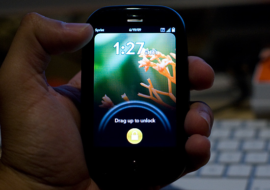
The Pre, like the iPhone, uses a multi-touch display. The touching works fairly well, almost as good as on the iPhone and far superior to any other touch phone I’ve used.
There are some differences of course.
The basic gestures are the same between the Pre and the iPhone. Pinch two fingers to zoom in, move them apart to zoom out. Flick your finger up or down the screen to scroll; do the same left/right to flip through pages, photos or cards. And double tap to zoom in on a web page.
On the iPhone, the multi-touch interface is limited to its large screen. The Pre doesn’t have as large of a screen but Palm attempts to make up for it by enabling touch in the area directly below the screen. Palm calls this the “gesture area”, which always seemed odd/misleading to me. You do perform certain gestures down there (wow), while others must be done on the screen itself.
The gesture area, as Palm calls it, helps extend the usable touch area of the screen, which is good. The gesture area happens to have a physical button in the middle of it, which is bad. There’s one frequently used gesture you perform in the gesture area, it’s a right to left swipe. This is how you traverse through a hierarchy of “windows” within a single application. For example, to get from here:

To here:

You perform that right to left swipe in the gesture area.
The problems with this gesture are two fold:
1) The R/L swipe goes over the protruding center button in the gesture area; it feels odd. Update: You can perform the gesture in the area to the left or right of the center button, effectively eliminating this issue. Sweet :)
2) More importantly, there’s a lag between when you complete the gesture and when the application responds to it. This isn’t really true for any of the other gestures, just this one. It hampers the user experience.
On the iPhone’s virtual keyboard, whenever you tap a key it enlarges in size above the key so you know what you hit. It’s a way of getting around the problem of your finger covering up most of the keys on an otherwise tightly packed keyboard. The Pre has a physical keyboard and thus doesn’t need such a thing, but for regular taps on the screen Palm does implement a cursor of sorts. Tap on the screen and you’ll see a little dot with ripples around it. It’s not huge but it does give you an indication of where you tapped.
While the Pre’s screen is just as responsive as the iPhone, I found the Pre is far more likely to ignore my taps than the iPhone. It seems like a software issue as I’ll sometimes tap the same item two or three times before it actually clicks on it for me. It’s not the end of the world, but annoying enough when it happens.


91 Comments
View All Comments
Griswold - Friday, June 19, 2009 - link
"Multitasking has been done by many smartphones before the Pre or iPhone, but no one has done it as smooth and as Apple-like as Palm."We're in the 3rd generation of iphones now and they still cant multitask. If palm does it perfectly, calling it "apple-like" is certainly inappropriate. Palms Pre is now the yardstick for multitasking on the mobile sector. Credit where credit is due, please.
Anand Lal Shimpi - Friday, June 19, 2009 - link
I meant it in a flattering way. That sort of praise is normally reserved for Apple; bestowing it upon Palm, not traditionally a recipient of such praise was intended to be an honor :-PTake care,
Anand
Johnmcl7 - Friday, June 19, 2009 - link
"Shame on Nokia, Motorola and the established cell phone industry for failing to do what it took Palm two years to do."Ok, so this point is made followed by compliments for multitasking and the cloud syncing however Nokia have had a similar multitasking system implemented in S60 for years (hold the app button to get a list of all apps and change to them as you want). Background apps can have their own data connections without interfering with each other and if you do push them too far the phone will warn you it's running low on memory. I find it strange that the lack of multitasking which is really a requisite for a smartphone has been so overlooked with the Iphone. Nokia's Ovi product lets you sync your system remotely or you can hook your contacts directly into the likes of Facebook with the latest version of S60.
While Nokia lack the flash of other companies however Apple still cannot match the featureset of the S60 phones that were out before the Iphone 2G and I find their core features to be extremely strong particularly signal reception - the 5800 can hold onto a signal where no other phone can which makes it considerably more useful given it is a phone after all.
Anand Lal Shimpi - Friday, June 19, 2009 - link
While Nokia has done a great job adding features to its phones over the years, on the UI side the innovation just hasn't been there. Both Apple and Palm deliver far more usable, simple and smooth UIs on their smart phones than I've seen from anyone else.If your cellphone UI has never bothered you then Nokia more than delivers capable handsets, however I believe (and I feel that a significant portion of the high end smartphone market agrees) that it's only been since the iPhone that we've seen real attention paid towards improving UI and user experience on these phones. Palm does a wonderful job of carrying the torch for the next leg imho.
Take care,
Anand
Connoisseur - Friday, June 19, 2009 - link
I totally agree. Everyone keeps harping on this article regarding the "features" and how they've been available for a long time in other phones. The feature-set aside, these phones just offer a level of smoothness and ease of use in the UI that 90% of the population is wowed about. Sure my old Treo offered a lot of functionality but it took an Apple to take the key components and make it such a pleasure to use.jmaine - Saturday, June 20, 2009 - link
Please define "genuine smartphone". Enlighten us to what the iPhone cannot do (and do well) that a Nokia smartphone would be a better choice for the masses? I switched to an iPhone after years of using Nokia, Motorola, Sony, Samsung and Blackberry phones. I even have a Treo 750 from work right now and I absolute hate it and all the former phones I've used and constantly switched between.TheProf, Connoisseur and Anand hit the nail on the head. It's the interface and usability, not the features that make a smart phone a commercial success. You can have a 12 megapixel phone with an OLED display, but with horrible software, support and application support. It will fail despite the strength of its hardware.
I've been reading a lot about the Palm Pre's problems since launch - overheating, poor battery life, and software crashes. Don't forget that a smart phone's function is to be a phone first, and everything else after. If you can't use its features without affecting it's essential functionality as a phone, it's a failure.
Johnmcl7 - Friday, June 19, 2009 - link
I don't see the point in having a fancy UI if there's nothing underneath it, I expect a lot of functionality from a smartphone (otherwise I would use a normal phone) and Apple still seems to be far behind where Nokia were years before. If you want a fashion phone then yes, a fancy UI is definitely a desirable feature.Also, I still fail to see why you 'shame' Nokia then praise Palm for a system which Nokia have had for many years.
Anand Lal Shimpi - Friday, June 19, 2009 - link
I believe that the iPhone and Pre do offer much more than a fancy UI, I believe they offer a good balance of features and good interface. Not holding phone makers to a high standard when it comes to UI is how we ended up in this mess in the first place, I don't believe now is the time to go back to our old ways.I'm not shaming Nokia for its multitasking support, I'm shaming Nokia for not producing a comparable Pre-like or iPhone-like UI in the years since the original iPhone's release. In my mind it should have been Nokia and Motorola who built the first iPhone, they had the experience; for Apple to come in and build such a successful smartphone indicates that there's something wrong with the way the established makers approach phone designs.
Take care,
Anand
Johnmcl7 - Friday, June 19, 2009 - link
That's because Nokia make genuine smartphones, not devices pretending to be smartphones just because they have a fancier interface - on the initial Iphone release it was missing features even standard phones had (such as proper bluetooth support). I honestly don't know how a phone as basic as the Iphone gets such a free ride on what is supposed to be a tech site - it's very slowly getting there but to me a device without multitasking cannot be considered a smartphone as that severely limits the device.Even on media features Nokia had Apple beaten hands down and still do in some areas, I'm waiting for the next release in the drip feed series of Iphones which will have a decent camera as at the moment they seem to be around three years behind on that front.
Overall I just much prefer Nokia's approach to a mobile phone - pack as many features into a phone to make it a powerful device rather than Apple's approach of putting at little as possible to force people to upgrade constantly. I guess I'll never understand how tech sites can get so wowed by an interface they can completely overlook the lack of any substance underneath it.
Samus - Saturday, June 20, 2009 - link
Yea... Nokia's smartphones are 'true' smartphones. Thats why Blackberry and Apple outsell Nokia smartphones like 50:1.Nokia makes sturdy dependable phones, but their IU has the elegence of a VW Golf dashboard. Boring. Boring. Boring.