The iOS 6 Review: Maps Thoroughly Investigated and More
by Brian Klug & Saumitra Bhagwat on September 19, 2012 2:21 PM ESTFinal Thoughts and Conclusions
Apple's iOS has now graduated into a fairly mature operating system. Features like Passbook and the new first party Maps application show that there still a lot of new tricks that we'll see despite where iOS is in its evolution curve.
The new Maps app and Passbook are easily the two biggest changes to iOS 6. The former is a bold move by Apple into controlling its own destiny, while the latter is a much needed feature that depends significantly on developers and third parties to make it useful.
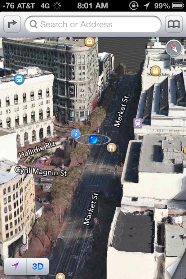
The new first party Maps application does surprisingly well given Apple's relative inexperience in the field. Turn by turn navigation works incredibly well, and for cities with good 3D data the flyover experience is quite impressive. The problem is Apple's Maps application simply doesn't have the wealth of data that backed up the old Google driven Maps app. Public transit routing and a good amount of location data are simply missing. The burden is now entirely on Apple to ramp up its dataset in order to replace what has been lost. The question that remains is how long it will take Apple to get there.
Both iOS 6 and the iPhone 5 represent fairly large steps for Apple in the direction of becoming even more vertically integrated. For Apple to continue to grow its business outside of adding new product categories, it will have to look to assimilating more users as well as increasing revenue per user. If average device prices don't go up, Apple simply has to take a larger portion of the revenue share per device. In iOS that manifests itself as replacing licensed Google services with its own, and we've already seen what that means for silicon in the iPhone. Apple is first and foremost a consumer company, so user experience must not suffer as it internalizes more of the world around it. In the case of Maps, the infrastructure is in place for user experience not to be an issue, but depending on what you used the app for in the past you may find yourself having taken a step backwards. Similarly, if you didn't rely on what's missing, you can just as easily find yourself in a better position in iOS 6. I suspect there's a roadmap to take Apple from here to feature parity with the old Maps across the board, but the public is never privy to such things.
Passbook is exciting if its power can truly be harnessed in the way Apple wants it to. The gap between where we are today and disappearing wallets is enormous. Being able to authenticate payments is a major step along the way to integrating wallet functionality, and Passbook isn't that. What the feature promises to do is slim down everything non-payment related in your wallet. Boarding passes, VIP/VIC cards for stores/restaurants, tickets to shows and games are all examples of things that don't directly interface with your credit card or bank account, but that can be relatively easily integrated into your smartphone today. The strength of the iOS ecosystem should really help push Passbook adoption along. Most major players in any service industry already have some sort of an iOS app presence. Extending support to Passbook should be a logical step. Once again we're left with a bit of a waiting game until everyone is on board but the point of these updates to iOS is really to enable functionality down the road.
Although not as shiny of a feature, iCloud Tabs in Mobile Safari really addresses a fundamental issue with the current OS X/iOS divide - transporting an experience between devices. It's often said that the tablet is a great consumption device but not ideal for many types of content creation workloads because of the lack of a physical keyboard and trackpad. Apple somewhat responded to these complaints with the introduction of apps like iPhoto and Pages. Even then, there's still going to be a not-insignificant group of users who use a Mac for work and an iPad for casual web browsing, watching movies, etc...
The problem with that usage model is it's always been clunky to move state between these two very different devices. The iPad arguably delivers a better browsing experience than a MacBook Pro, but if you have to email yourself a dozen links to stop browsing on your notebook and start again on your tablet the experience becomes more of a burden. iCloud tabs in Mobile Safari works well to address this specific usage scenario. Furthermore, like most of the other iCloud enabled features, cloud tabs does a good job of encouraging customers to buy within the Apple ecosystem. It's a somewhat worrisome future that we're headed towards where everyone is building these fairly independent platforms that work best within an ecosystem rather than across boundaries. For now the sacrifice seems worth it as the payoff is something that works very well, but I worry about what happens down the road if you're forced to buy a device not because it's the best device for you, but because buying an alternative would hurt the experience on another, unrelated device.
The rest of iOS 6 is a mixture of polishing up existing features and adding new ones that were long overdue for Apple. Facebook integration is a classic example, and should have been implemented a long time ago, right alongside Twitter integration. Improvements to the dialer with its new Do Not Disturb feature are good to see as many still use their iOS devices to make calls. The remodeled stores and backend optimizations for better app discovery are all welcome additions.
There's still tons of room for improvement. Other than Windows 8, none of the new OSes have done a great job of dealing with the problem of displaying content from two applications at once. On a phone it's perhaps not the best idea, but on a tablet where screen size/real estate are more plentiful there's a definite need for a real, simultaneous multitasking solution. New notifications (and the notification center) from iOS 5 helped alleviate some of the pressure here, but there's still room for evolution.
The yearly iOS cadence continues to be a smart move on Apple's part. While updates may range in significance depending on your usage model, in building marketshare it's important to deliver regular updates that help keep the platform feeling new. With the latest version of iOS, Apple does just that. There are new features both big and small, and enough small improvements to keep it fresh.
What iOS 6, Android 4.1 or Windows 8/RT/Phone 8 fail to do however is establish a single dominant winner in the market. This war is far from over, which is a great thing for pushing innovation.


105 Comments
View All Comments
tipoo - Wednesday, September 19, 2012 - link
Pretty sure the 4S is faster than the 4 :)Ryan Smith - Wednesday, September 19, 2012 - link
I'm assuming you must be referring to the SunSpider results? In that case lower is better, so everything looks correct here.tipoo - Wednesday, September 19, 2012 - link
I think they were changed, when I looked last the 4 had lower Sunspider and higher Browsermark scores, and it also had N/A beside the other two, now the 4S has the N/A and better scores.Henk Poley - Wednesday, September 19, 2012 - link
Related, I consistently get a Sunspider 0.9.1 score of about 3000 +/- 1% on my iPhone 4 GSM. Typo? 33.. instead of 30.. ?dsumanik - Thursday, September 20, 2012 - link
blah blahThe new maps suck...they are a significant step down, in dataset AND functionality.
Users in the US might ALMOST get the same experience but everywhere else on the planet got screwed.
There are spelling errors, missing roads, improperly labeled cities and for the most part, significantly less detailed maps.
I live in a very remote community, in northern canada...there is a GOOGLE STREET VIEW picture of my house and street.
There is no way Apple will ever come up here to offer the same level of detail...im simply in too small of a market.
There isnt even color photos of my town.
LOL!
Jobs would never have let this slide until it was competitive... right now it simply is inferior in every single way.
mrgulabull - Wednesday, September 19, 2012 - link
The "trouble building" you mention actually looks like that. It's the Walt Disney Concert Hall. If anything I'd say the 3d model is remarkably good.Here's an aerial shot from Google Maps
https://maps.google.com/maps?q=walt+disney+concert...
ratte - Wednesday, September 19, 2012 - link
It's the building above that (the Dorothy Chandler pavillion) that looks badBrian Klug - Wednesday, September 19, 2012 - link
OH wow, ok, well that's interesting... Fixing now.-Brian
nathanddrews - Thursday, September 20, 2012 - link
If you had seen the "Get Smart" movie, you would know. :Prd_nest - Wednesday, September 19, 2012 - link
Seriously, whatever I have seen so far, Apple maps are absolute failure in India. It's actually pathetic in terms of actual data. Forget about features, they simply don't have data. It's so bad that I can't even think why they should launch iOS 6 here? Comparison with google maps?? just forget it.. and all those fancy 3D flyover, well probably by 2025 if we are lucky..