The Windows 10 Review: The Old & New Face of Windows
by Brett Howse on August 25, 2015 8:00 AM EST- Posted in
- Operating Systems
- Microsoft
- Windows 10
More Desktop Changes
One of the goals of Windows 10 is to entice Windows 7 users to migrate to the new operating system. The additions we’ve seen already to the traditional mouse and keyboard interface have already been substantial, and should make most Windows 7 users comfortable. But they are not the only changes to the desktop. There is a little bit for everyone, both casual users and enthusiasts alike, so lets check out some more of the new features of Windows 10’s desktop.

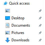
Windows 8 changed up Windows Explorer, and brought in the ribbon menu. Office 2007 was the first Microsoft program to move from the file menu to the ribbon menu, and while it was controversial at the time, it is now very familiar. Moving Windows Explorer to a ribbon menu made it both easier to use with touch, as well as exposing settings and features that may have been tucked away in a submenu before. Windows 10 evolves this. Opening up Windows Explorer now greets you with a list of files you have recently accessed in the main pane. The thinking is that when you go to Explorer, you are likely looking for something you’ve used before. I won’t dispute the logic, but I prefer to see the computer view myself. Luckily it’s an easy option to change by clicking File->Change folder and search options. What I do like though is the Quick Access feature in Windows Explorer, which gives you – you guessed it – quick access to folders that are used a lot. The system will automatically add folders you go to frequently which is kind of great for discoverability, and you can add or remove any folder here. I have found it very useful, and since it is also built into the file picker for saving files, it makes it easy to get where I want to go when saving files.
Another nice feature to come to Windows Explorer is the Share contract. Windows 8 introduced contracts, which allow apps to communicate with one another over dedicated protocols, and adding it to Windows Explorer is a great way to expand them from the tablet style apps to the desktop. Share was likely the most useful contract, and I was always disappointed that the Windows 8 Charms did not offer any functionality on the desktop, so this is a great addition.

There are also small changes which improve Windows 10 over Windows 8. Things like having drop shadows back. Windows 8 went for a very flat UI, and it was clean looking but the lack of depth was not very useful with multiple windows open. Adding drop shadows back give the subtle definition around windows to make them stand out a bit more.
One of my favorite features that has come to Windows 10 is the ability to scroll an inactive window. Prior to Windows 10, and assuming you were not running a third party utility which enabled this, in order to scroll a window you had to first select it. Now, you can just move your mouse over any open window and use the scroll wheel to move whatever window you are over. You can do this on windows that are buried three or four deep – as long as you can see some of it you can scroll it. It is great when you are referencing a PDF or site, and writing at the same time, since you can continue to type while scrolling around in your reference document. For those that think this is insane, yes, you can turn it off.

Windows 8 seemed to signal that Microsoft was looking to a future past the desktop. There were some nice changes brought to the Windows 8 desktop but they were overshadowed by the changes brought in by the touch-first UI. With Windows 10, Microsoft is not only trying to bring back the focus on the desktop, they have added a lot of great features as well which should certainly entice users of both Windows 7 and 8.1 to want to switch.


293 Comments
View All Comments
boeush - Tuesday, August 25, 2015 - link
Seems like a pretty huge and notable regression, if indeed true - definitely worthy of first-class treatment in the review article!Brett Howse - Wednesday, August 26, 2015 - link
It's OK it's not true you can set Screen Time on a per day basis with pretty granular settings.Brett Howse - Wednesday, August 26, 2015 - link
All of the screen time settings are on the web now and they are very robust. Please check that out.ciparis - Tuesday, August 25, 2015 - link
"in a bit to make it usable with the tablet form factor"I think you meant bid.
Ryan Smith - Tuesday, August 25, 2015 - link
Right you are. Thanks!Glock24 - Tuesday, August 25, 2015 - link
Why didn't anyone mention the ugly font rendering in "modern" apps, notification center, settings, or anything that uses the new metro/modern/store apps framework?The UI scaling also seems half baked and inconsistent. When not using 100% scaling (on my laptop it defaults to 150%, everything looks ugly. I changed it to 100% but some system dialogs seem bypass my settings and show bigger fonts than it should.
UI scaling in OS X is light years ahead (and no, I'm not a Mac user, my primary OS is Linux).
The flat dull gray "theme" looks ugly in my opinion has poor contrast, making it difficult for sure people to easily spot the scroll bar in some programs. Also active or inactive windows look not very different.
Why have two control panels? What's even worse is that not all settings are available in neither of them.
Glock24 - Tuesday, August 25, 2015 - link
Oh I forgot to mention the forced updates and no changelog from MS. These constant forced updates will change functionality or add creatures in the future. It's like all windows 10 users are beta testers.Oxford Guy - Tuesday, August 25, 2015 - link
The scroll bars in the Mac OS have regressed tremendously. They're small and grey and disappear.Oxford Guy - Tuesday, August 25, 2015 - link
And I haven't used it a lot, but Yosemite seems to make it hard to even resize windows by dragging the bottom corner. It's like there is a deal between Apple and MS to worsen the UIs.chrome_slinky - Wednesday, August 26, 2015 - link
The UI is the worst Microshaft has ever produced. Mostly due to laziness. Just look at many things just a couple of levels down, and you see essentially things identical to Windows 7 or earlier - ALL OF THIS with the paid shills swearing Microsoft has COMPLETELY REWRITTEN Windows.That doesn't even pass the Homer Simpson test.