Microsoft's KIN: A Eulogy
by Brian Klug on July 13, 2010 3:42 PM EST- Posted in
- Smartphones
- Microsoft
- KIN
- Mobile
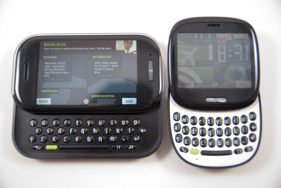
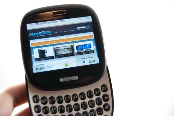
There were two faces of the KIN. The ONE, a rounded yet squarish device with a 2.6" (66.04 mm) screen, and the TWO, which was a landscape slider with a 3.4" (86.36 mm) screen.
Forget the TWO, if the KIN were on your must have list, the device to have was the ONE.
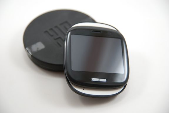
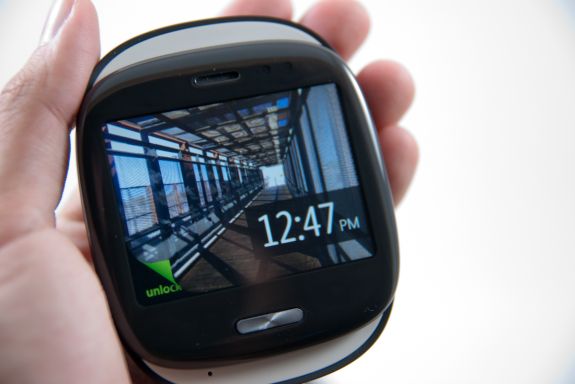
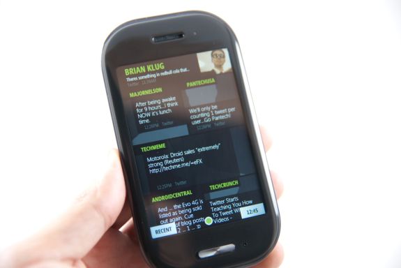
Having carried both for over a month, there's no doubt in my mind that that if the KIN was a couple, the ONE was the much much better half. Form factor wise, it was different enough to be cool, and that at-first awkward square shape turned out to be what set it apart from every other device I've encountered. It was small, compact, and fresh. If you've played with a Palm Pre, the ONE is like a miniature, more square version with matte plastic. It's curvy but squarish, and there's a nice filleted edge on the back, so it rests in your palm naturally. My girlfriend took to calling it a tamagotchi - honestly, I don't think it's far from the mark. In a good way.
The 3.x" screen form factor slate is everywhere these days. In fact, it seems to be an Android and iOS mainstay to keep that form factor of devices in our pockets on into the future. It works, it's tried and true, but you know what? It's getting boring, fast. The Palm Pre was exciting because it was different and new - I just got that same vibe with the KIN ONE.
The KIN TWO was soulless, unfortunately. It looked and feelt like a bland attempt at making a landscape slider, just for the sake of having one in the lineup. It's a form factor that's been done better so many times by so many other manufacturers, that anything but perfect execution stands out - which is why the TWO felt so generic.
I originally suspected the TWO would be my favorite because of its spacious landscape keyboard, which would make it the better device for SMS. To my surprise, I found the ONE just as easy if not easier to type on. In fact, even though the TWO had a larger screen, 8 megapixel camera, and recorded 720p video, I'd gladly sacrifice any of those features for a smaller device that feels different like the ONE. The ONE actually felt occasionally faster too, no doubt thanks in part to the smaller display resolution bring rendered.
Until we get foldable displays or roll out screens, the 3.x" slate form factor smartphone will rule. The Sidekicks had some of the most radical form factors in the smartphone business, so it was depressing to see something as generic as the TWO being the result of so much of that talent. That said, the ONE was a unique form factor that felt just right for the KIN platform.




60 Comments
View All Comments
brokensoul - Thursday, July 15, 2010 - link
One thing people seem to forget (too...), is the constant sync on android devices with your google services (mails, talk,...), along for most devices with a sync with facebook, flickr and twitter. The iPhone doesn't come close to that (even with the last iOS4), and WM is a laugh in that perspective. Deactivate those syncing (or slow them down), and android devices last much longer, easily one day and a half for my legend.notposting - Tuesday, July 13, 2010 - link
The Motorola Devour had that Sidekick form factor as well, really liked it quite a bit.I had it for about a month and a half...the keyboard on it, the general build quality, most everything about it was phenomenal, except for:
the shitty camera--3MP supposedly, no flash, no auto-focus, just crap.
lousy reception--the reason I traded it in for a Droid
of course it still hasn't been rooted (or updated past 1.6) so that's pretty disappointing as well. And it looks like Motorola is hellbent on locking down their new phones to completely take the mod/hack/customizing communities out of play.
mcnabney - Wednesday, July 14, 2010 - link
The metal case and internal antenna really hurt the Devour. Running a slow chip and old Android OS didn't help either.DigitalFreak - Tuesday, July 13, 2010 - link
Android has captured the market for "open" phones (i.e.: open app store, etc.). Apple has the fanboy and zealot market cornered. I can't see very many people choosing WP7 over either of those two.FATCamaro - Tuesday, July 13, 2010 - link
The arstechnica article from a week or two ago is far better on the topic. This article is written from a fanboy perspective and ignores reality completely. The reality of MS essentially killing Danger after buying them for a few hundred million.Stuka87 - Wednesday, July 14, 2010 - link
I had the same feeling. This article is missing a lot of details, which isn't the norm for this site.strikeback03 - Wednesday, July 14, 2010 - link
What, a fanboi of a disappearing OS? I personally didn't feel all the internal microsoft bickering had to be included here (it is documented elsewhere) and instead this article was written from a perspective of "Is there anything positive to pull out of this?" And I thought it did that well instead of focusing on the specifics of the phones as not many will be buying them anyway.inspire - Friday, July 16, 2010 - link
So an article about the phone and its features, pros, and cons, but sans-drama is fanboyish? Ars always finds a way to inject drama. All their self-righteous treaties on the ethics of video game reviews, and such.The article is titled 'a eulogy'. If you want the TMZ version - stick with Ars.
s1ugh34d - Tuesday, July 13, 2010 - link
WinMo really does take all those points, and put them in a more business approached user interface, while taking notes from classic IT user requirements.My TyTn II definitely does everything the KIN, iOS, WebOS, and android phones can, just it's been able to since before them...
Now I can't say it has the flare, GUI or app style. The Microsoft app store is the worst software I ever thought to install. The graphics are something HTC has been holding back forever. Otherwise functionality speaking, I can do anything you can do, just it may take me a day to figure it out.
What it comes down to is what YOU do. I read about 75 RSS feeds daily(long commute.) I also listen to Pandora the whole time. Meanwhile between my feed reader, the browser or browsers I may be running, Pandora, and typically word/excel/foxit, I still make it 5-8 hours constant usage(which translates into a day adding in time I actually have to do stuff IRL) oh and Wifi is on for at least three of those hours.
I upload pictures directly after taking them via email, which is one click from the after-shot menu. Facebook conveniently is on my homescreen(I don't use the other sites so much) as well as my favorite feature, contacts stay as is, until I open them click, the Facebook link, and from the UI I can pick any info I want synced.
Wifi syncing on Activesuck, works(only because there isn't any good open source alternative.) and Google sync keeps my online calendar up to date with stuff I have to do, as well as backs up my contacts. Since I don't text(yea smartphone user so long I've replaced SMS with POP...)backing up messages is my gmail. Plus my backup for microSD is Wifi at home(yea networking try that iOS and android playaz) When I connect to my network, bam my SD is ghosted(as real files) and sync occurs with my file server.
I like the KIN's web app. I really hope that transfers into the WP7 features. Danger definitely had something going for them, hope M$ uses a few hint from there world. The Dell mini 5 is on my next list, but the HD2 is my very next.
Darth_Bob - Wednesday, July 14, 2010 - link
I would have to agree to a certain point. I have a LG Incite, Winmo 6.1. I havent seen enough from Android or iOS to switch yet. Ive been multi-tasking for well over a year, can go 2 days without charging with moderate use. I can VPN to my home network via Hamachi, use remote desktop to connect to any computer on the network.Have had SPB Mobile Shell since 3.0.1, recently updated to 3.5.5 - great features, totally customizable UI.
WinMo was really great for the IT/professional aspect, but not so great for the average consumer aspect - which is where the money is.
Although I have AT&T, that HD2 is next on my list as well, as soon as my contract is up (shortly).
As for the KIN, they were aiming for a demographic already covered. Im surprised someone OK'd the release.