Microsoft's KIN: A Eulogy
by Brian Klug on July 13, 2010 3:42 PM EST- Posted in
- Smartphones
- Microsoft
- KIN
- Mobile
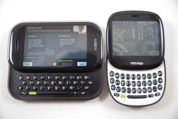
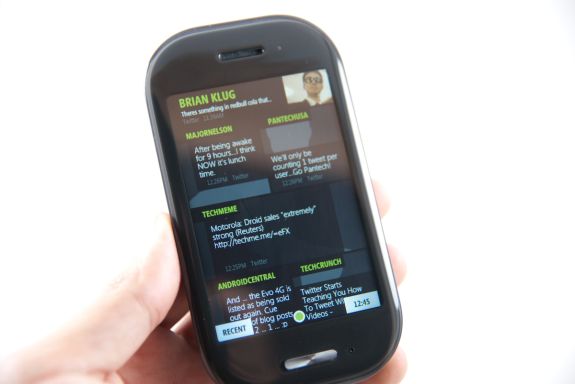
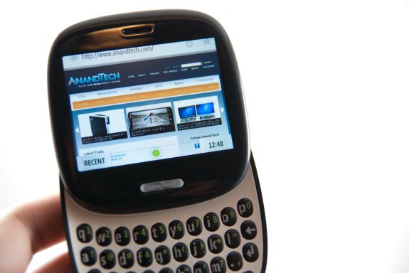
There were two faces of the KIN. The ONE, a rounded yet squarish device with a 2.6" (66.04 mm) screen, and the TWO, which was a landscape slider with a 3.4" (86.36 mm) screen.
Forget the TWO, if the KIN were on your must have list, the device to have was the ONE.
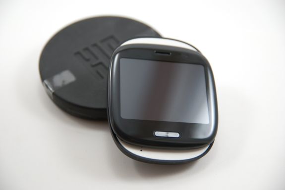
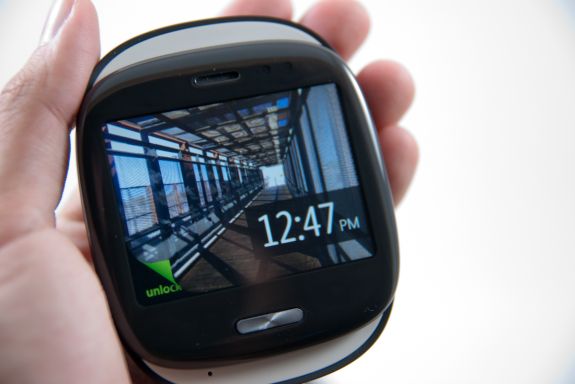
Having carried both for over a month, there's no doubt in my mind that that if the KIN was a couple, the ONE was the much much better half. Form factor wise, it was different enough to be cool, and that at-first awkward square shape turned out to be what set it apart from every other device I've encountered. It was small, compact, and fresh. If you've played with a Palm Pre, the ONE is like a miniature, more square version with matte plastic. It's curvy but squarish, and there's a nice filleted edge on the back, so it rests in your palm naturally. My girlfriend took to calling it a tamagotchi - honestly, I don't think it's far from the mark. In a good way.
The 3.x" screen form factor slate is everywhere these days. In fact, it seems to be an Android and iOS mainstay to keep that form factor of devices in our pockets on into the future. It works, it's tried and true, but you know what? It's getting boring, fast. The Palm Pre was exciting because it was different and new - I just got that same vibe with the KIN ONE.
The KIN TWO was soulless, unfortunately. It looked and feelt like a bland attempt at making a landscape slider, just for the sake of having one in the lineup. It's a form factor that's been done better so many times by so many other manufacturers, that anything but perfect execution stands out - which is why the TWO felt so generic.
I originally suspected the TWO would be my favorite because of its spacious landscape keyboard, which would make it the better device for SMS. To my surprise, I found the ONE just as easy if not easier to type on. In fact, even though the TWO had a larger screen, 8 megapixel camera, and recorded 720p video, I'd gladly sacrifice any of those features for a smaller device that feels different like the ONE. The ONE actually felt occasionally faster too, no doubt thanks in part to the smaller display resolution bring rendered.
Until we get foldable displays or roll out screens, the 3.x" slate form factor smartphone will rule. The Sidekicks had some of the most radical form factors in the smartphone business, so it was depressing to see something as generic as the TWO being the result of so much of that talent. That said, the ONE was a unique form factor that felt just right for the KIN platform.




60 Comments
View All Comments
mcnabney - Wednesday, July 14, 2010 - link
Important tools buried within menus.Dependence on a specific computer to sync.
Too damn many things to do just to make a call.
Navigation required a stylus due to tiny menus and icons.
Too many lockups, reboots, battery yanks, and software incompatibilities.
Most devices were EXTREMEMLY unreliable.
Non-existent followed by limited push email support.
I could go on and on....
aebiv - Thursday, July 15, 2010 - link
So make a shortcut where you want it.I haven't synced to a computer in years.
I push one button and dial a number to make a call, or I tell it to make a call.
I'd rather be able to use a stylus, than have a capacitive screen that won't allow for precise input.
I can give you lists of people who have very few lockups, and I've seen quite a few Android and Apple phones lockup as well.
My original Motorola Q is still running strong, so are many others.
Activesync/Exchange support has always been best on the windows mobile devices, the VZ Droid STILL can't get push mail fixed. You have to buy a third party app called Touchdown to get it to work semi decently.
Please, do go on.
kmmatney - Friday, July 16, 2010 - link
If the average person plays with a windows mobile phone and an iPhone at the AT&T store, then they will buy the iPhone - it's that simple.aebiv - Saturday, July 17, 2010 - link
Exactly. The average person bought the Motorola RAZR too.This current trend for marketing a "smartphone" for the masses is leading to a loss of features and flexibility for those of us who truly want a "Pocket PC."
nangryo - Sunday, July 18, 2010 - link
That makes you above average person and under average person I believe.I think you just thin that you are the first right?
What a sad fellow
aebiv - Sunday, July 18, 2010 - link
You don't even make sense here.nangryo - Sunday, July 18, 2010 - link
Living on your dream world eh? Where you assume that everyone is just like youGo then, use your beloved stylus. just don't use it for.... anything else
lol
aebiv - Sunday, July 18, 2010 - link
No, I never said everyone was like me.Do you see me ripping on the iPhone for being a horrible design because it doesn't do what I want? No, I don't. All I am doing is pointing out that there are some of us, who don't want to have a locked down, limited, glorified feature phone that has 3 big buttons on the screen because it is supposed to be "thumb friendly."
You ever try to use RDP on a 3" screen? It is hard enough on a 4.3" screen without a stylus.
mrdeez - Wednesday, July 14, 2010 - link
Its because the Android OS doesn't have any way of completely closing apps once their open. Get Advanced Task Killer and use it every time you sleep your phone. I have seen my battery life go from 4-5 hours to 7-8.aebiv - Wednesday, July 14, 2010 - link
No, even using that in keeping the tasks closed. If you disable sense on the WinMo and go with SPB or use Titanium the battery life difference is even more drastic.