Microsoft's KIN: A Eulogy
by Brian Klug on July 13, 2010 3:42 PM EST- Posted in
- Smartphones
- Microsoft
- KIN
- Mobile
In another review, Anand wrote some words that I can't get out in my head because they're so true: "Apple has started a trend of companies spending entirely too much on packaging." Truer words haven't been spoken, but the KIN did have some of the most unique packaging I've ever seen. There's been some other memorable packaging out there, including the 'Hacker Edition' N900 packaging which requires using terminal commands over serial to open the box.
The KIN packaging was different. It was hip, modern, and innovative. If nothing else, it shows that Microsoft can still get radically creative when it matters.
I'd like to point out that what's particularly odd about smartphone packaging is that - most of the time - you don't even get to unbox your own phone if you're purchasing it at a retail store. A carrier employee will take the phone out, activate it, and hand it to you. This has been the case for me at least with every phone I've ever purchased which was subsidized. Sometimes they'll ask you if you want to take it out of the box, but it's rare in my experience. Even though packaging isn't something the user frequently gets to dive into when buying at a store, it does set a first impression - which is likely why so much importance is afforded to it. But I digress.
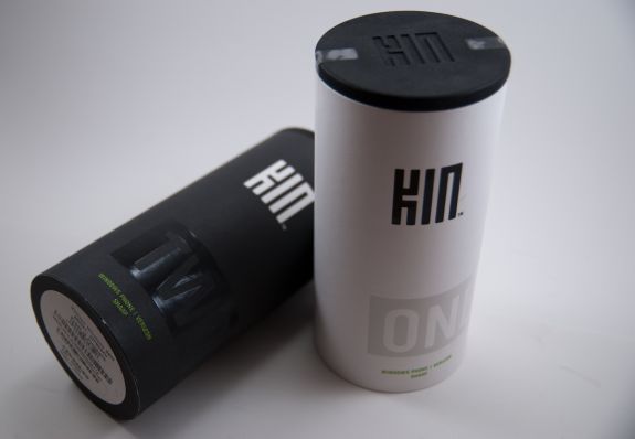
The KIN came in colorful cardboard tubes with rubbery caps at top and bottom. The ONE comes in a white tube, while the TWO comes in a black one. The first impression the KIN packaging sets is that it's radically different - just like the phones themselves.
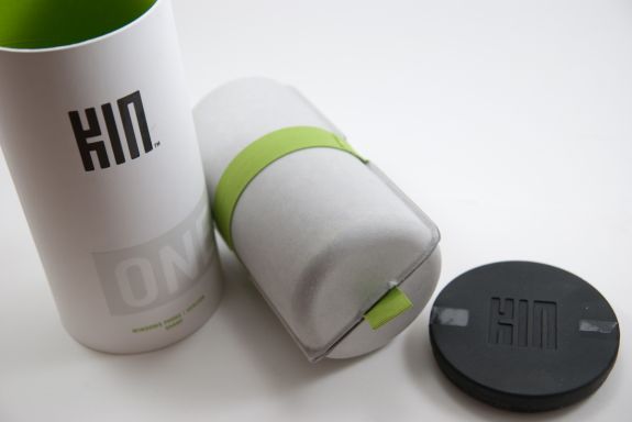
Pop the top off the pringles, er... KIN can (there's a joke in there about a can-can waiting to be had), and there's a green felt pull tab and a cardboard holder. Pull on that, and out comes a tube wrapped with the same kind of elastic green felt.
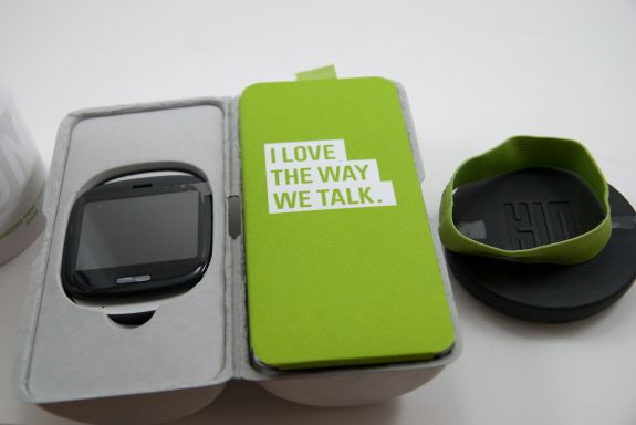
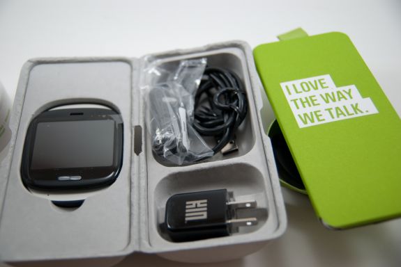
Take that felt ring off, open the cardboard fold, and you've got the phone in an inset on one side, and instructions, cables, and power adapter on the other. The TWO has the same affair, except the inset is slightly larger to accomodate the taller form factor.
It was different, and it worked for the KIN. The devices weren't smartphones, weren't featurephones either - completely different packaging just made sense. Packaging is functional too however, and there's a reason most smartphone boxes are small and squarish. Squares have better packing density for transportation reasons. Cylinders - not as much. Microsoft made a bold choice going with a much larger than normal package that was flashy and different.


60 Comments
View All Comments
mcnabney - Wednesday, July 14, 2010 - link
Important tools buried within menus.Dependence on a specific computer to sync.
Too damn many things to do just to make a call.
Navigation required a stylus due to tiny menus and icons.
Too many lockups, reboots, battery yanks, and software incompatibilities.
Most devices were EXTREMEMLY unreliable.
Non-existent followed by limited push email support.
I could go on and on....
aebiv - Thursday, July 15, 2010 - link
So make a shortcut where you want it.I haven't synced to a computer in years.
I push one button and dial a number to make a call, or I tell it to make a call.
I'd rather be able to use a stylus, than have a capacitive screen that won't allow for precise input.
I can give you lists of people who have very few lockups, and I've seen quite a few Android and Apple phones lockup as well.
My original Motorola Q is still running strong, so are many others.
Activesync/Exchange support has always been best on the windows mobile devices, the VZ Droid STILL can't get push mail fixed. You have to buy a third party app called Touchdown to get it to work semi decently.
Please, do go on.
kmmatney - Friday, July 16, 2010 - link
If the average person plays with a windows mobile phone and an iPhone at the AT&T store, then they will buy the iPhone - it's that simple.aebiv - Saturday, July 17, 2010 - link
Exactly. The average person bought the Motorola RAZR too.This current trend for marketing a "smartphone" for the masses is leading to a loss of features and flexibility for those of us who truly want a "Pocket PC."
nangryo - Sunday, July 18, 2010 - link
That makes you above average person and under average person I believe.I think you just thin that you are the first right?
What a sad fellow
aebiv - Sunday, July 18, 2010 - link
You don't even make sense here.nangryo - Sunday, July 18, 2010 - link
Living on your dream world eh? Where you assume that everyone is just like youGo then, use your beloved stylus. just don't use it for.... anything else
lol
aebiv - Sunday, July 18, 2010 - link
No, I never said everyone was like me.Do you see me ripping on the iPhone for being a horrible design because it doesn't do what I want? No, I don't. All I am doing is pointing out that there are some of us, who don't want to have a locked down, limited, glorified feature phone that has 3 big buttons on the screen because it is supposed to be "thumb friendly."
You ever try to use RDP on a 3" screen? It is hard enough on a 4.3" screen without a stylus.
mrdeez - Wednesday, July 14, 2010 - link
Its because the Android OS doesn't have any way of completely closing apps once their open. Get Advanced Task Killer and use it every time you sleep your phone. I have seen my battery life go from 4-5 hours to 7-8.aebiv - Wednesday, July 14, 2010 - link
No, even using that in keeping the tasks closed. If you disable sense on the WinMo and go with SPB or use Titanium the battery life difference is even more drastic.