Google Redesigns Hangouts for Android With Version 4.0
by Brandon Chester on August 10, 2015 11:15 AM EST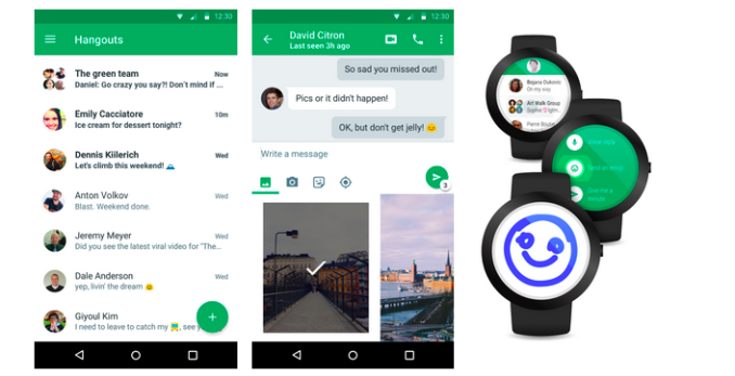
Today Google shipped a major update to their Hangouts application for Android. Ever since Hangouts for iOS was updated to 4.0 a little over a month ago Android users have been waiting for the update to make its way to Android. This update has been in the pipeline for quite some time, and it comes with a comprehensive redesign that brings the Hangouts app in line with Google's Material Design visual guidelines.
Visually, Hangouts 4.0 for Android is very similar to what shipped on iOS a little while ago. This isn't surprising, as Google's applications for iOS use their Material Design principles heavily. There are a few small differences, such as the spacing of the quick access buttons underneath the message input field, and the calling controls not being hidden behind the three dot overflow menu, but the overall appearance is the same. The appearance is definitely a departure from the previous design which had a strange dual list design which was separated into two tabs.
On top of the redesign, Google claims that Hangouts 4.0 has noticeable improvements to performance, reliability, and battery consumption. I personally have never had many issues with Hangouts on Android, but any improvements to performance are always welcomed.
Hangouts 4.0 is currently rolling out in stages, and users can expect to receive the update in the near future if they haven't already.
Source: Official Google Blog


37 Comments
View All Comments
bug77 - Monday, August 10, 2015 - link
You're missing the point (not that it appears you have actually tried to grasp it).Material design is not supposed to be the ultimate UI language. Everyone knows you can't please all your users if you have more than one (unless you're Apple). Material design is Google's first foray into platform consistency. From that point of view it does its job quite well.
And about the "all white" complaint, some Android developer builds actually have a dark theme toggle, but it seems it's not ready for prime time yet.
soccerballtux - Monday, August 10, 2015 - link
that's interesting, but could have happened without the mistakesmkozakewich - Tuesday, August 11, 2015 - link
No app should have a light/dark toggle. That toggle should have been built into Lollipop itself, using a simple algorithm to alter the luminosity of the accent colours and set the whites to a kind of muted grey.deV14nt - Sunday, August 16, 2015 - link
I did not know that anyone referred to a type of gray as muted. I thought only actual colors could be muted. Gray is muted by definition. http://i.imgur.com/9d761xD.jpgdhanson8652 - Monday, August 10, 2015 - link
Does the new version automatically download and execute MMS (stagefright vulnerabililty)? Did they change the defualts?steven75 - Monday, August 10, 2015 - link
Google's message to users seems to be: "Want the best Google Apps on a timely basis? Use iOS!"LOL
LauRoman - Monday, August 10, 2015 - link
What apps would those be because you must be smoking something.Brandon Chester - Monday, August 10, 2015 - link
He's referring to how Hangouts has received several updates on iOS before they come to Android.Midwayman - Monday, August 10, 2015 - link
Wonder if it supports group SMS correctly yet?LauRoman - Monday, August 10, 2015 - link
Probably not.